          indicator
6032 EN.ATM.CO2E.PC
6048 EN.ATM.METH.PC
6059 EN.ATM.NOXE.PC
                                                                   name
6032                             CO2 emissions (metric tons per capita)
6048                Methane emissions (kt of CO2 equivalent per capita)
6059 Nitrous oxide emissions (metric tons of CO2 equivalent per capita)Quantitative Methods Bootcamp
2023-09-27
Descriptive Inference
expand for full code
library(ggplot2)
pl <- ggplot(wd.df, aes(x = gdp_pc, y = co2_pc, size = population, color = region)) +
  geom_point(alpha = 0.5) +
  theme_minimal() + scale_y_log10() +  scale_x_log10(labels = scales::dollar_format()) +
  labs(y = "CO2 emissions per capita (log-transformed)", x = "GDP per capita (log-transformed)")

pl
Descriptive: What are the average CO2 emissions of all European countries?
Descriptive Inference
What are the average CO2 emissions of all European countries?
Code
# Create group means (only for complete observations)
tmp.df <- wd.df[, c("region", "gdp_pc", "co2_pc")]
tmp.df <- tmp.df[complete.cases(tmp.df),]
means.df <- aggregate(tmp.df[, c("gdp_pc", "co2_pc")],
                      by = list(region = tmp.df$region),
                      FUN = function(x) mean(x, na.rm = TRUE))

# Plot
pl_mean <- ggplot(wd.df, aes(x = gdp_pc, y = co2_pc, color = region)) +
  geom_point(data = wd.df, mapping = aes(x = gdp_pc, y = co2_pc, size = population, color = region),
             alpha = 0.5) +
  geom_point(data = means.df,
                  mapping = aes(x = gdp_pc, y = co2_pc,  fill = region),
                  size = 4, shape = 25, color = "yellow") +
  theme_minimal() + scale_y_log10() +  scale_x_log10(labels = scales::dollar_format()) +
  labs(y = "CO2 emissions per capita (log-transformed)", x = "GDP per capita (log-transformed)")

pl_mean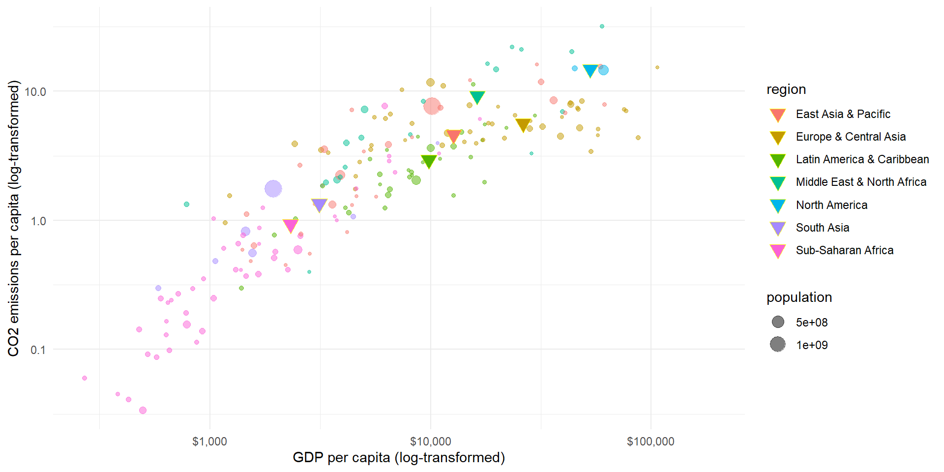
Causal Inference
expand for full code
pl2 <- ggplot(wd.df, aes(x = gdp_pc, y = co2_pc, size = population, color = region)) +
  geom_smooth(aes(group = 1), show.legend = "none") + geom_point(alpha = 0.5) +
  theme_minimal() + scale_y_log10() +  scale_x_log10(labels = scales::dollar_format()) +
  labs(y = "CO2 emissions per capita (log-transformed)", x = "GDP per capita (log-transformed)")

pl2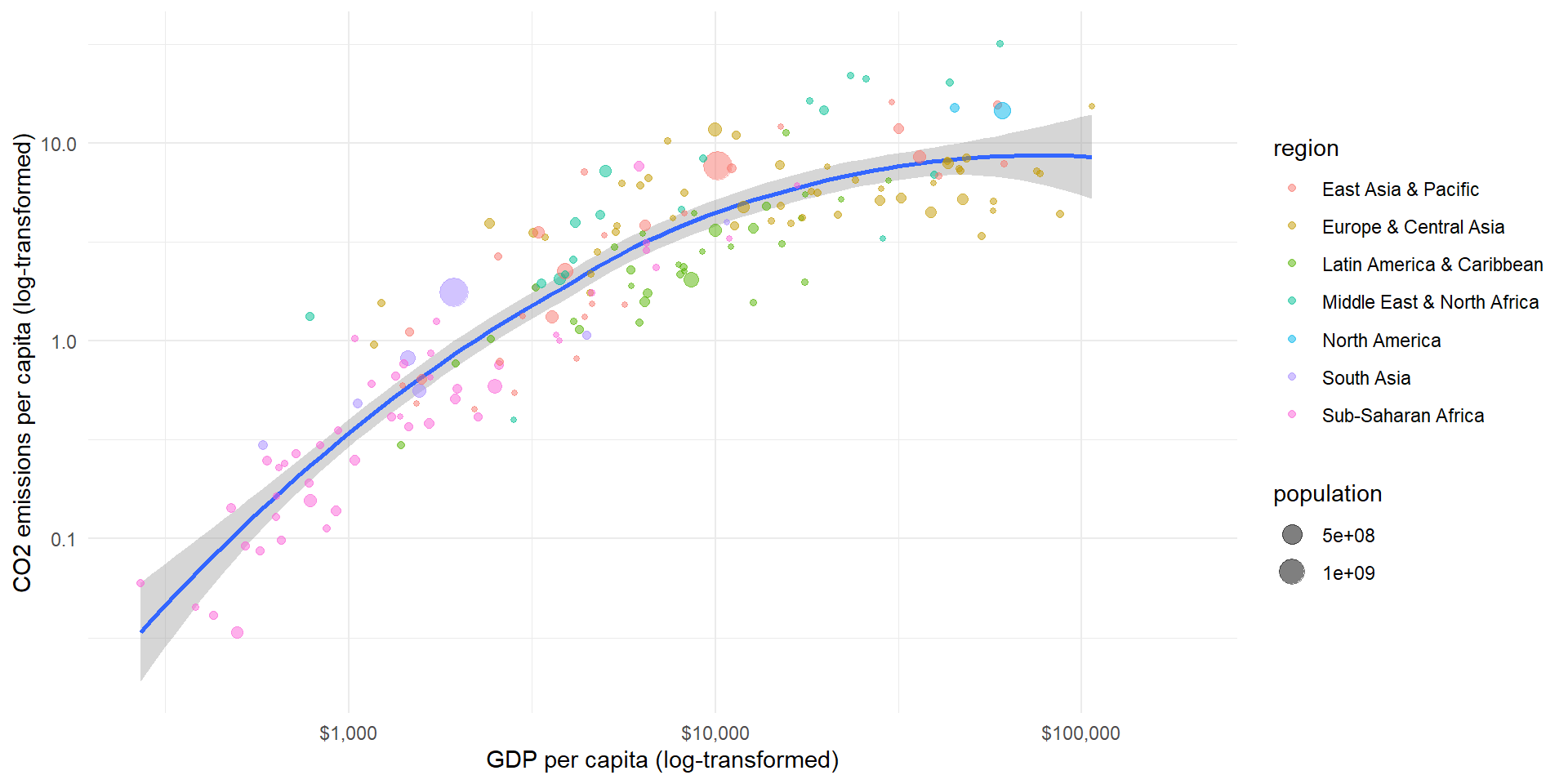
Causal: How does GDP influence the amount of CO2 emissions?
Distribution
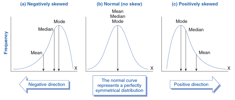
Variables can be characterized by their frequency distribution:
The distribution of the (relative) frequencies of their values
- E.g., we can graph the world income distribution:

Distributions: Example I
expand for full code
# Seed for random number
set.seed(12345)

# Normal distribution
d1 <- data.frame(x = rnorm(10000, 0, 1), dist = "mean = 0, sd = 1")
d2 <- data.frame(x = rnorm(10000, 1, 1), dist = "mean = 1, sd = 1")
d3 <- data.frame(x = rnorm(10000, 0, 2), dist = "mean = 0, sd = 2")

p <- ggplot(rbind(d1, d2, d3), aes(x = x)) +
  geom_density(aes(color = dist, linetype = dist), size = 1.5) +
  labs(y = "Density", x = "Variable x") + theme_bw() +
  ggtitle("Normal distribution")
p
Distributions: Example II
expand for full code
# Chi Squared distribution
d2 <- data.frame(x = rchisq(10000, 2), dist = "df = 2")
d3 <- data.frame(x = rchisq(10000, 4), dist = "df = 4")
d4 <- data.frame(x = rchisq(10000, 8), dist = "df = 8")

p <- ggplot(rbind(d2, d3, d4), aes(x = x)) +
  geom_density(aes(color = dist, linetype = dist), size = 1.5) +
  labs(y = "Density", x = "Variable x") + theme_bw() +
  ggtitle("Chi-squared distribution")
p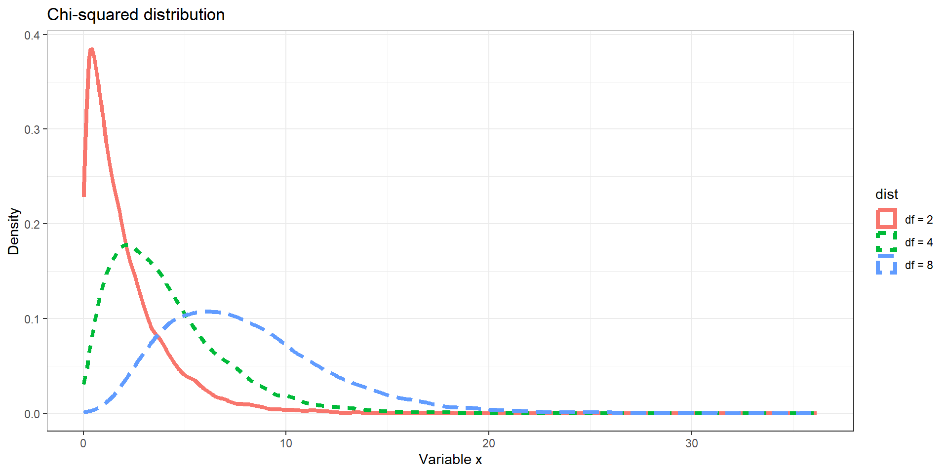
Distributions: Example III
Distributions can take on many different shapes
Measures of Dispersion
expand for full code
# Seed for random number
set.seed(12345)

# Normal distribution
d1 <- data.frame(x = rnorm(10000, 0, 0.5), dist = "sd = 0.5")
d2 <- data.frame(x = rnorm(10000, 0, 1), dist = "sd = 1")
d3 <- data.frame(x = rnorm(10000, 0, 3), dist = "sd = 3")

p <- ggplot(rbind(d1, d2, d3), aes(x = x)) +
  geom_density(aes(color = dist, linetype = dist), size = 1.5) +
  labs(y = "Density", x = "Variable x") + theme_bw() +
  ggtitle("Normal distribution") + geom_vline(xintercept = 0)
p
Example I

Example I
Code
# use log transformed variables
wd.df$ln_gdp_pc <- log(wd.df$gdp_pc)
wd.df$ln_co2_pc <- log(wd.df$co2_pc)

# calculate covariance
cov <- cov(wd.df$ln_gdp_pc, wd.df$ln_co2_pc, use = "complete.obs")

# sd
sd_gdp <- sd(wd.df$ln_gdp_pc, na.rm = TRUE)
sd_co2 <- sd(wd.df$ln_co2_pc, na.rm = TRUE)

# correlation
cor <- cor(wd.df$ln_gdp_pc, wd.df$ln_co2_pc, use = "complete.obs")

# Plot with linear line
pl3 <- ggplot(wd.df, aes(x = gdp_pc, y = co2_pc, size = population, color = region)) +
  geom_smooth(aes(group = 1), method = 'lm', show.legend = "none") +
  geom_point(alpha = 0.5) +
  theme_minimal() + scale_y_log10() +  scale_x_log10(labels = scales::dollar_format()) +
  labs(y = "CO2 emissions per capita (log-transformed)", x = "GDP per capita (log-transformed)") +
  ggtitle(paste("Pearsons correlation = ", round(cor, 3)))

pl3
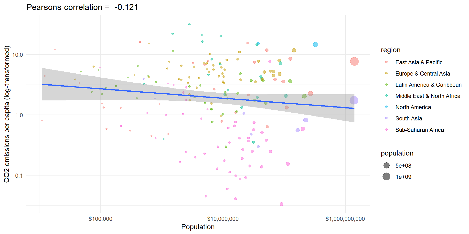
Example II
Code
# use log transformed variables
wd.df$ln_population <- log(wd.df$population)
wd.df$ln_co2_pc <- log(wd.df$co2_pc)

# calculate covariance
cov <- cov(wd.df$ln_population, wd.df$ln_co2_pc, use = "complete.obs")

# sd
sd_gdp <- sd(wd.df$ln_population, na.rm = TRUE)
sd_co2 <- sd(wd.df$ln_co2_pc, na.rm = TRUE)

# correlation
cor <- cor(wd.df$ln_population, wd.df$ln_co2_pc, use = "complete.obs")

# Plot with linear line
pl3 <- ggplot(wd.df, aes(x = population, y = co2_pc, size = population, color = region)) +
  # geom_smooth(aes(group = 1), method = 'lm', show.legend = "none") +
  geom_point(alpha = 0.5) +
  theme_minimal() + scale_y_log10() +  scale_x_log10(labels = scales::dollar_format()) +
  labs(y = "CO2 emissions per capita (log-transformed)", x = "Population") +
  ggtitle(paste("Pearsons correlation = ", " ?"))

pl3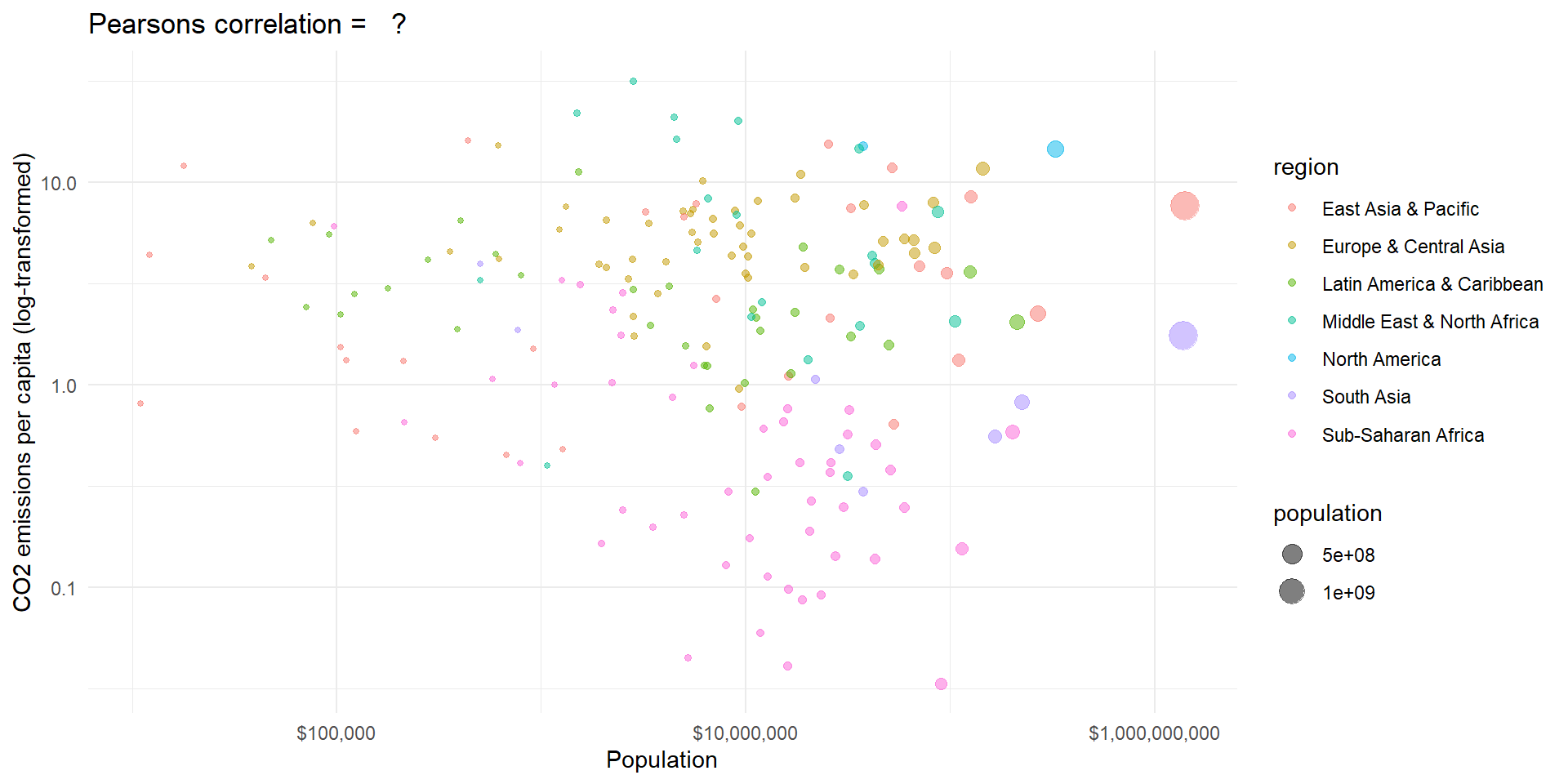
Example II
The world is more complex
An example: wage
Code
# Get example data
library(plm)
data("Wages")

# Reduce data frame to cross-section
Wages$year <- rep(c(1976:1982), 595)
wages_cs.df <- Wages[which(Wages$year == 1976), ]

# Reduce to 50 individual random sample
set.seed(653210)
wages_cs.df <- wages_cs.df[sample(1:595, 50), ]

# Means
means.df <- aggregate(wages_cs.df[, c("ed", "lwage")],
                      by = list(union = wages_cs.df$union),
                      FUN = function(x) mean(x, na.rm = TRUE))

# Plot with linear line
pl3 <- ggplot(wages_cs.df, aes(x = ed, y = lwage, color = union, shape = union)) +
  geom_point(alpha = 1) +
  geom_point(data = means.df, mapping = aes(color = union),
             alpha = 0.5, stroke  = 2, size = 2, shape = c(1,2), show.legend = FALSE) +
  theme_minimal() +
  labs(y = "log-transformed wage", x = "Education years") +
  ggtitle("50 individuals from the Panel Study of Income Dynamics")

pl3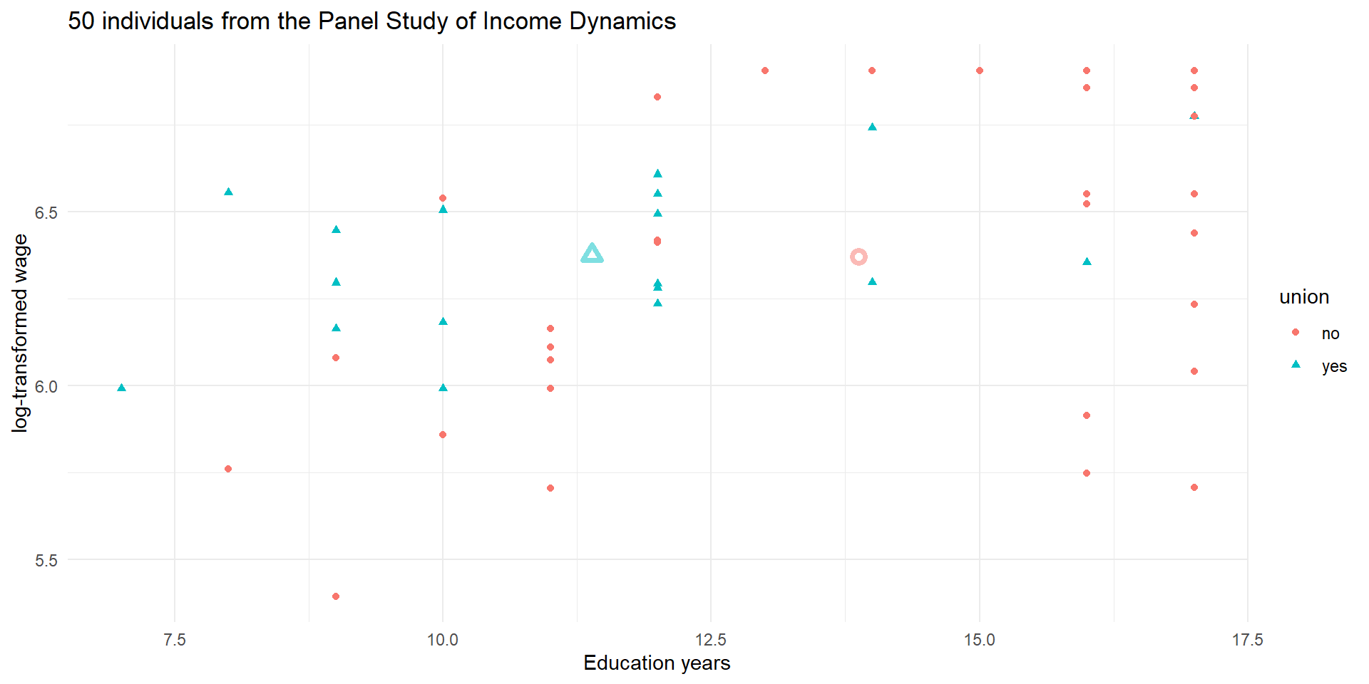
An example: wage
Code
library(gganimate)

# Residualise y
tmp.mod1 <- lm(lwage ~ union, data = wages_cs.df)
wages_cs.df$lwage_resid <- resid(tmp.mod1)

# Residualise x
tmp.mod1 <- lm(ed ~ union, data = wages_cs.df)
wages_cs.df$ed_resid <- resid(tmp.mod1)

# Create data of states to animate
df <- rbind(data.frame(lwage = wages_cs.df$lwage,
                       ed = wages_cs.df$ed,
                       union = wages_cs.df$union,
                       resid = 0),
            data.frame(lwage = wages_cs.df$lwage_resid,
                       ed = wages_cs.df$ed,
                       union = wages_cs.df$union,
                       resid = 1),
            data.frame(lwage = wages_cs.df$lwage_resid, # just to duplicate
                       ed = wages_cs.df$ed,
                       union = wages_cs.df$union,
                       resid = 2),
            data.frame(lwage = wages_cs.df$lwage_resid,
                       ed = wages_cs.df$ed_resid,
                       union = wages_cs.df$union,
                       resid = 3),
            data.frame(lwage = wages_cs.df$lwage_resid, # just to duplicate
                       ed = wages_cs.df$ed_resid,
                       union = wages_cs.df$union,
                       resid = 4),
            data.frame(lwage = wages_cs.df$lwage_resid, # just to duplicate
                       ed = wages_cs.df$ed_resid,
                       union = wages_cs.df$union,
                       resid = 5))

means.df <- aggregate(df[, c("lwage", "ed")],
                   by = list(union = df$union,
                             resid = df$resid),
                  FUN = function(x) mean(x, na.rm = TRUE))


# Plot with linear line
pl4 <- ggplot(df, aes(x = ed, y = lwage, color = union, shape = union)) +
  geom_point(alpha = 1) +
  geom_point(data = means.df,
             alpha = 0.5, stroke  = 2, size = 2, show.legend = FALSE) +
  theme_minimal() +
  labs(y = "log-transformed wage", x = "Education years") +
  ggtitle("50 individuals from the Panel Study of Income Dynamics")+
  transition_states(resid, wrap = FALSE) +
  shadow_mark(alpha = 0.7, size = 1)
  # + view_zoom(nsteps = 3, include = TRUE,
  #           look_ahead = 4, wrap = FALSE)

pl4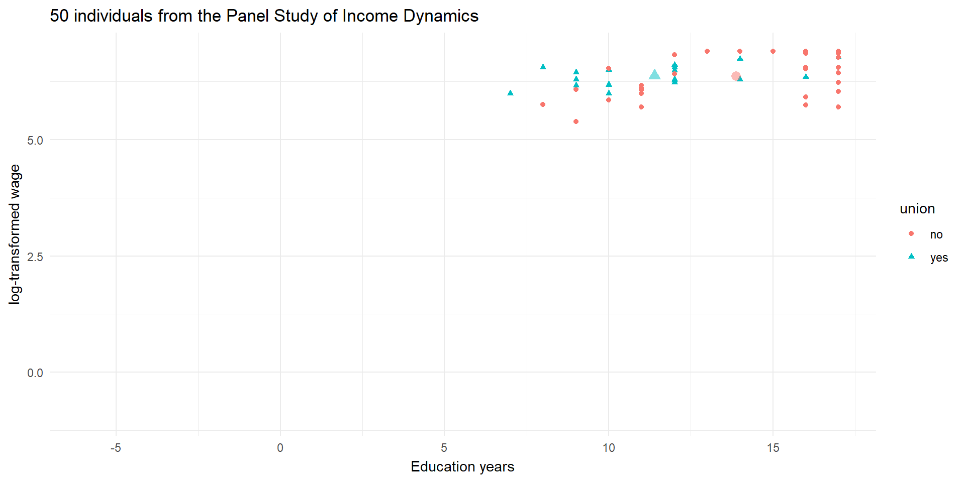
An example: wage
Code
# Means
means.df <- aggregate(wages_cs.df[, c("ed_resid", "lwage_resid")],
                      by = list(union = wages_cs.df$union),
                      FUN = function(x) mean(x, na.rm = TRUE))

# Plot with linear line
pl5_0 <- ggplot(wages_cs.df, aes(x = ed_resid, y = lwage_resid)) +
  geom_point(aes(color = union, shape = union), alpha = 1) +
  geom_point(data = means.df, mapping = aes(color = union),
             alpha = 0.5, stroke  = 2, size = 2, shape = c(1,2), show.legend = FALSE) +
  theme_minimal() +
  labs(y = "residualized log-transformed wage", x = "residualized Education years") +
  ggtitle("50 individuals from the Panel Study of Income Dynamics")

pl5_0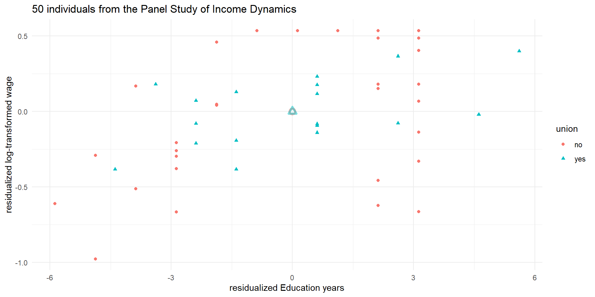
An example: wage
Code
 # fit the model
fit <- lm(lwage_resid ~ ed_resid, data = wages_cs.df)

# Save the predicted values
wages_cs.df$predicted <- predict(fit)

# Save the residual values
wages_cs.df$residuals <- residuals(fit)

library(ggpubr)

# Plot with linear line
pl5 <- ggplot(wages_cs.df, aes(x = ed_resid, y = lwage_resid)) +
  geom_point(aes(color = union, shape = union), alpha = 1) +
  geom_point(data = means.df, mapping = aes(color = union),
             alpha = 0.5, stroke  = 2, size = 2, shape = c(1,2), show.legend = FALSE) +
  geom_smooth(aes(group = 1), method = 'lm', show.legend = "none", se = FALSE) +
  geom_segment(aes(xend = ed_resid, yend = predicted), alpha = .2, color = "purple") +
  geom_point(aes(x = ed_resid, y = predicted), alpha = 0.5, shape = 1, color = "red") +
  theme_minimal() +
  labs(y = "residualized log-transformed wage", x = "residualized Education years") +
  ggtitle("50 individuals from the Panel Study of Income Dynamics") +
  stat_regline_equation(aes(label = ..eq.label..))

pl5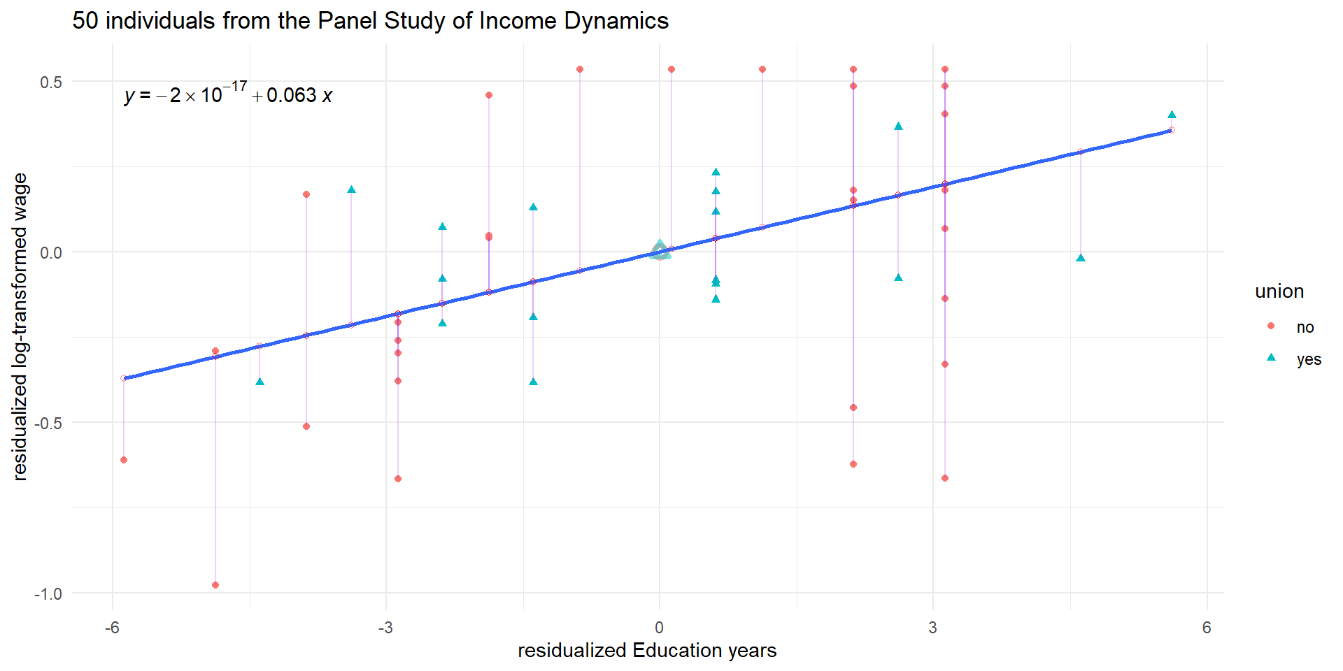
Stata’s Interface: Variables Window
The variables window displays all variables in your dataset
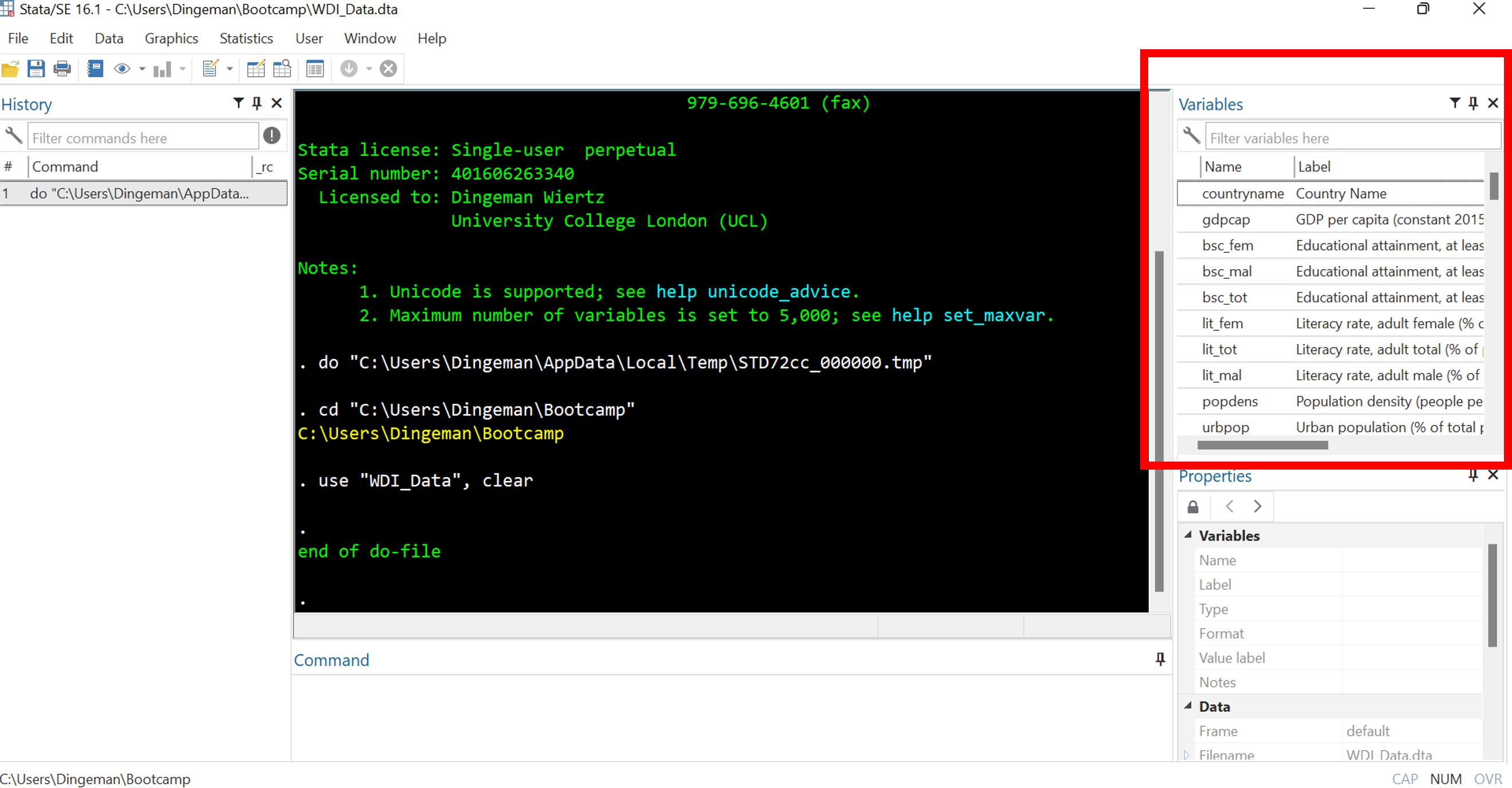
- Single click on variable names to see details in properties window
- Double click to make variables appear in command window
Stata’s Interface: Properties Window
The variables window displays all variables in your dataset
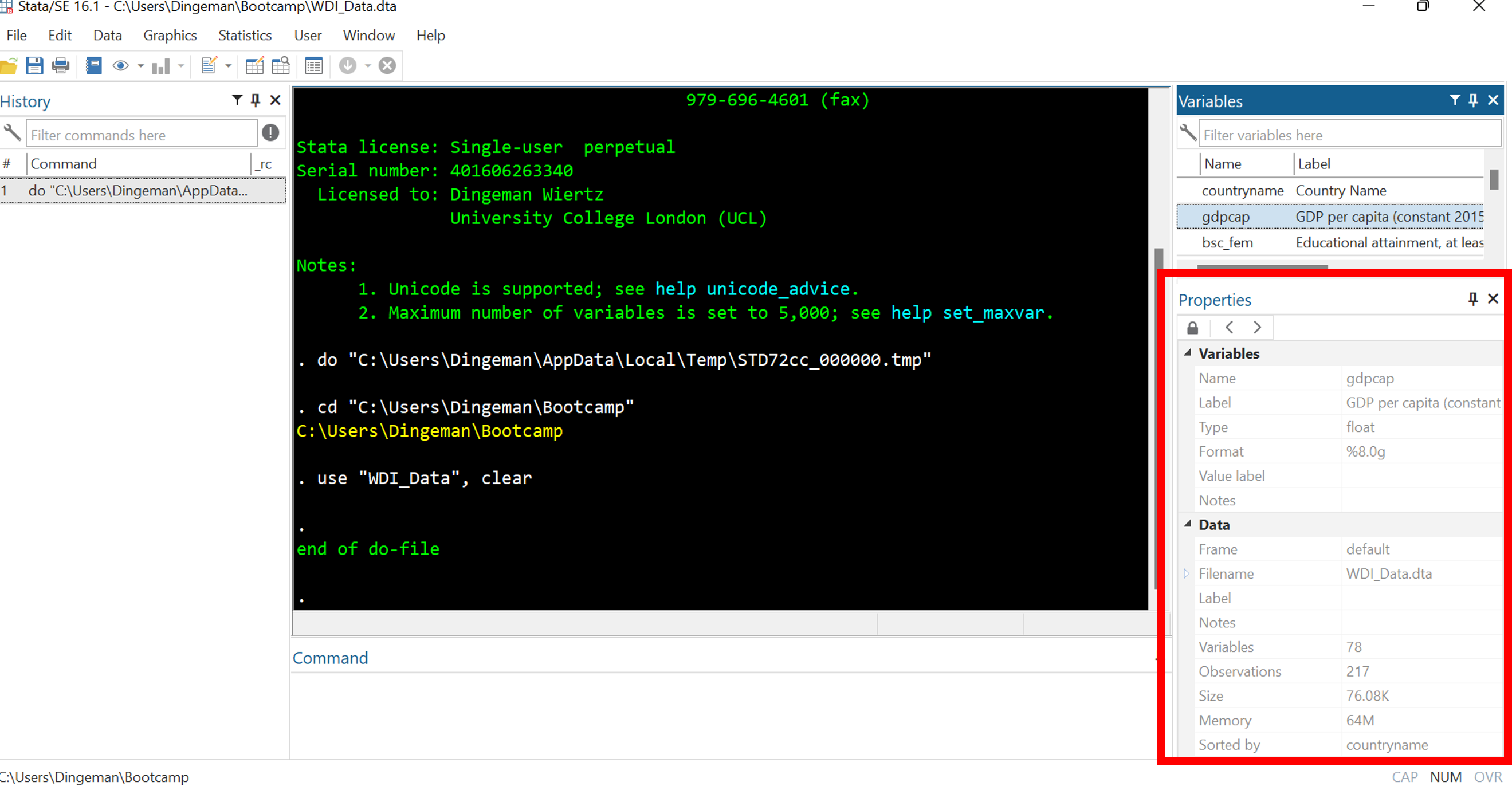
The properties window displays details about selected variables as well as the entire dataset (e.g., number of observations, sort order)
Stata’s Interface: Command Window
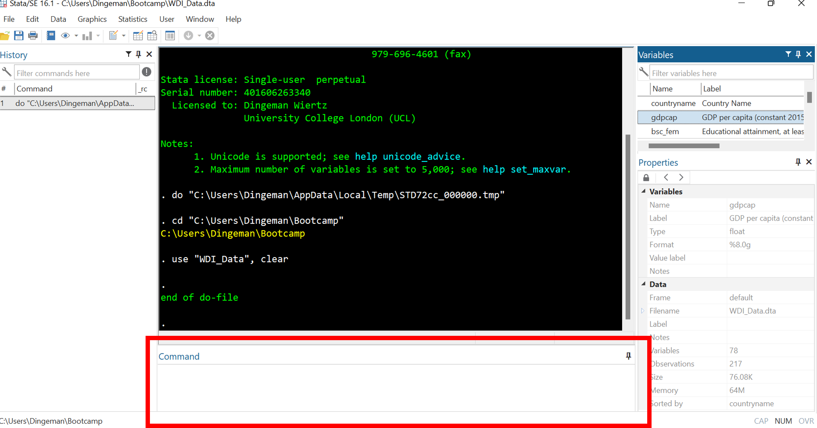
The command window is for entering and executing commands
- But it is better to use do-files (same applies to drop-down menus)
Stata’s Interface: Results Window
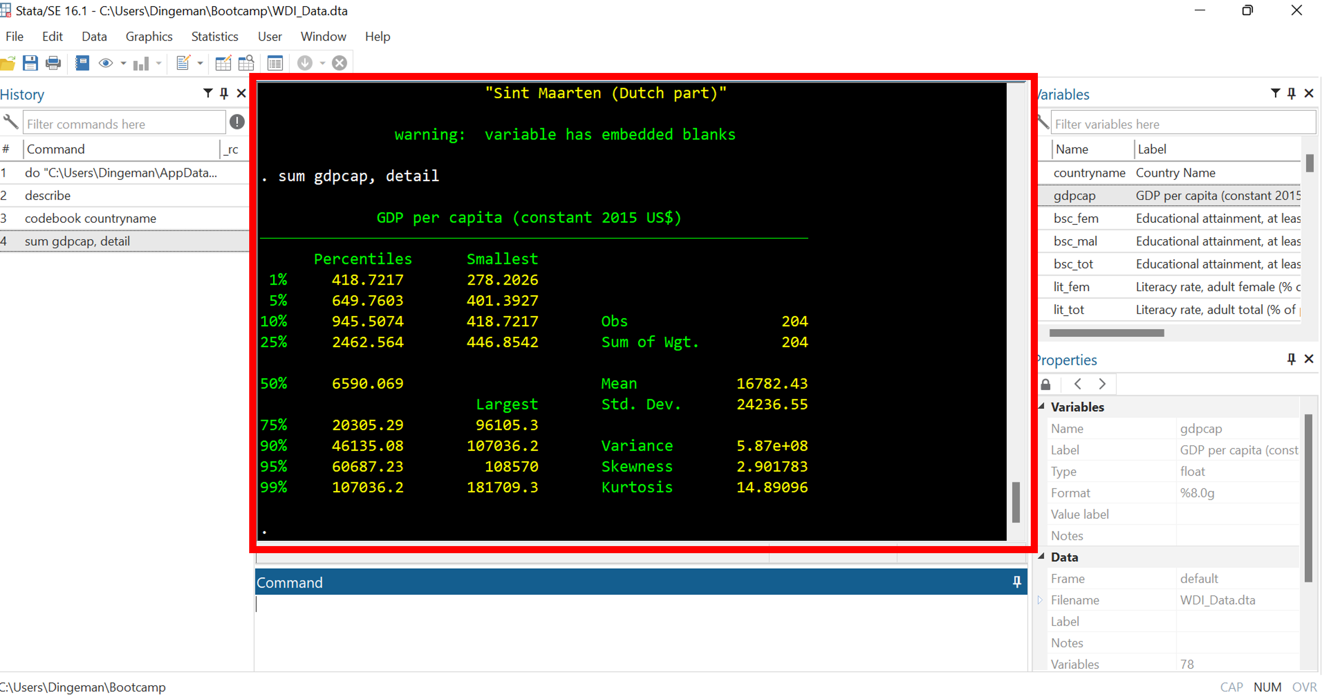
The results window displays all output of your commands
Stata’s Interface: Command History and Current Working Directory
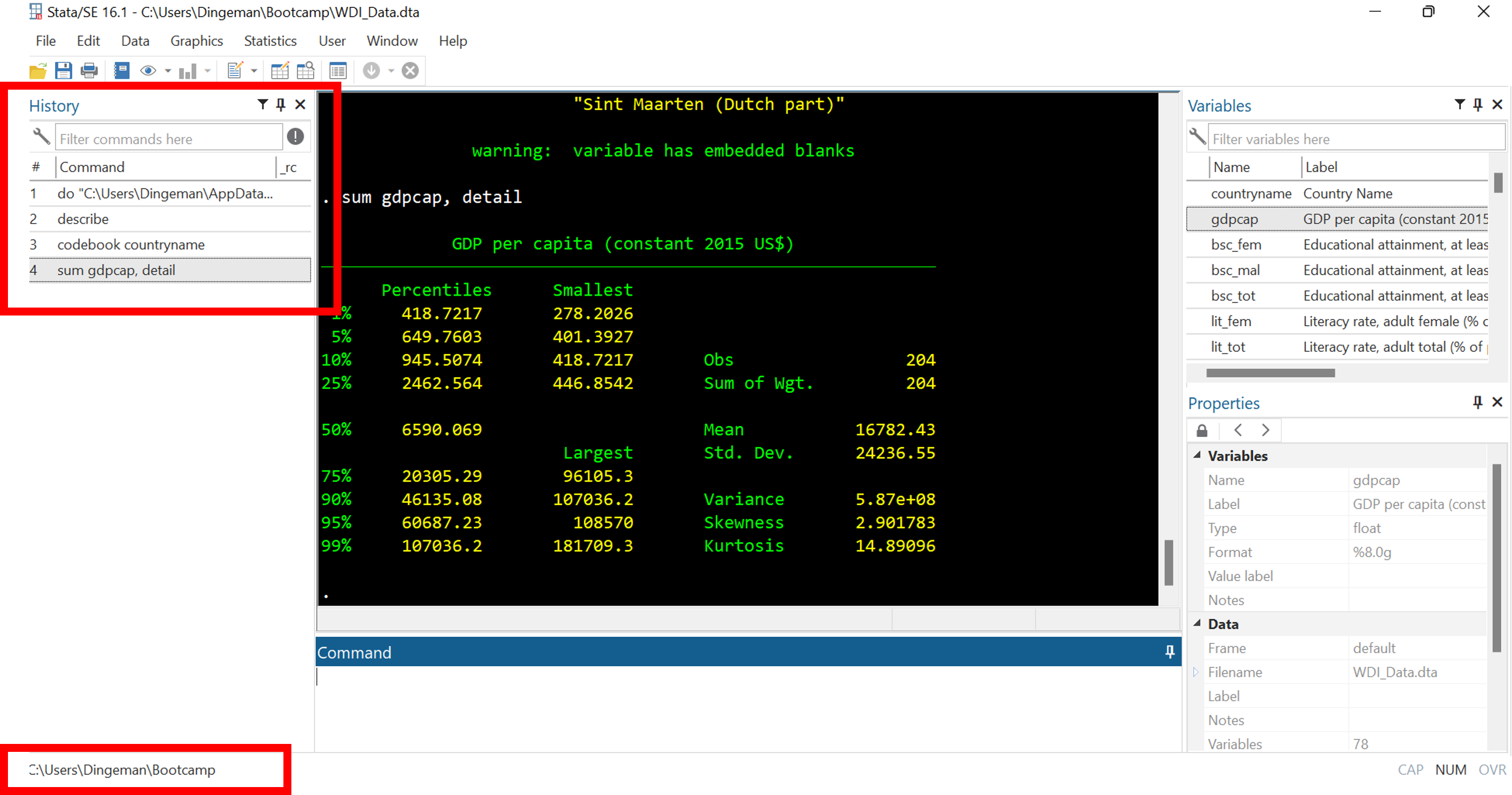
The command history window lists previously run commands
- At the bottom you can see the current working directory: the folder where any files will be loaded from and saved to
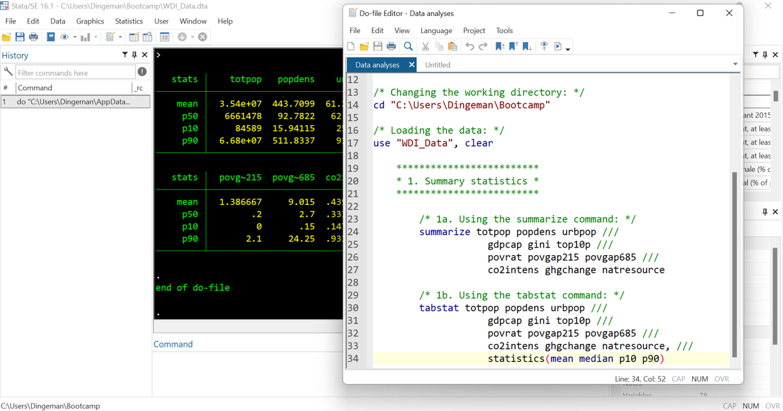
Stata’s Interface: Opening a Do File
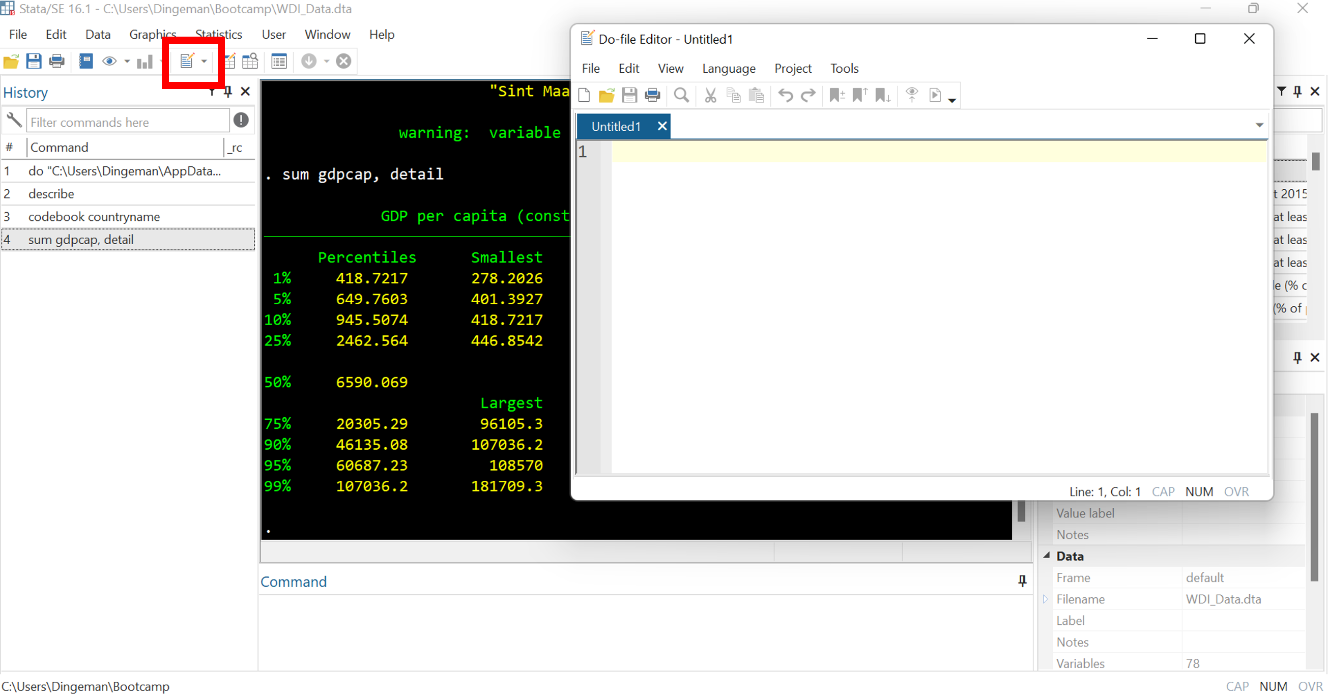
Do files are text files where you can store commands for reuse
- Huge payoffs for reproducibility, debugging, adapting commands
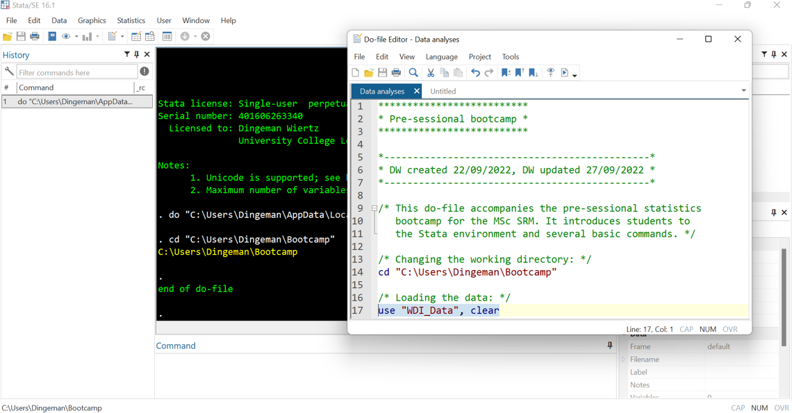
Running Commands from a Do File

After entering a command, you select it, and then click the “execute” button or press “Ctrl+D”
Do File Dos and Don’ts
- Use annotations to facilitate replicability (incl. for future self!):
- Use * for single-line comments and /* */ for multiple lines
Do File Dos and Don’ts
- Break down code into clearly labelled sections / subsections
- Use tab indentations to making things easy to read
Do File Dos and Don’ts

- Don’t put too much information on a single line
- Use /// to continue your command on the next line and
- write “top-to-bottom” instead of “left-to-right”
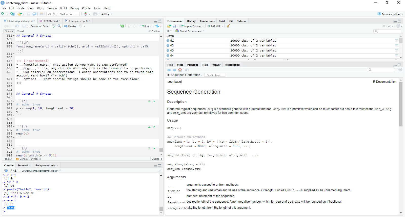
R & R Studio Interface

General Stata Command Syntax

Stata commands mirror everyday commands in their structure:
- They often start with a verb: “Bring me…”
- They then list an object: “… a pint of milk…”
- They may add a condition: “… if it is still before noon…”
- They may specify further details after the comma: “, quickly please” or “, I want semi-skimmed”
In nearly all cases, Stata syntax consists of four parts:
- Command: What action do you want to see performed?
- Names of variables, files, objects: On what objects is the command to be performed (“varlist”)
- Qualifier(s) on observations: Which observations are to be taken into account (and how)? (“if”, “in”, “weight”)
- Options: What special things should be done in the execution?
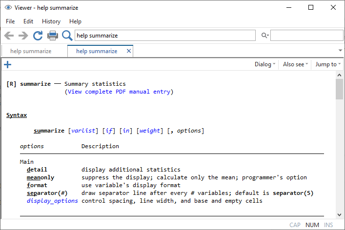
“help [command]” is your friend
“?[command]” is your friend
Define your working directory
This is a path: “C:/work/Lehre/Bootcamp_slides/” (look the slash direction)